I truly love to see bookcases in homes because they are the perfect solution for adding storage and style to your surroundings. Books and collectibles on display add warmth and personality to any space, whether it’s a living or dining area, bedroom or home office. To any visitor, a bookcase will communicate what you read, what you collect, and what you love. Bookcases are a window into your passions and pursuits, and an opportunity for you to put your most favorite things on display.
The challenge for most people is how to style a bookcase well. How do you maximize both utility and aesthetic appeal, but also avoid monotony and clutter? Styling a bookcase is an art, but a job easily tackled if you study those done right.
It Starts with the Back
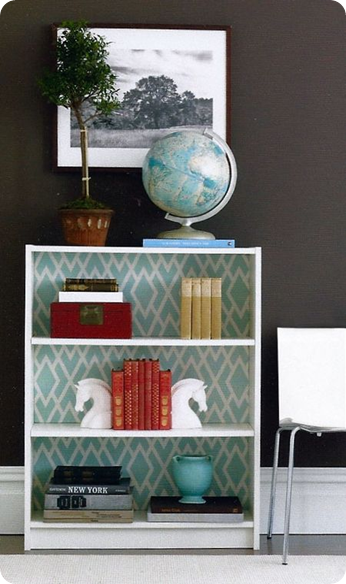
Simple inexpensive bookcases become stunners when their backs are dressed up with paint, fabric or wallpaper. The bookcase below was brought to life with a pattern that accentuates the balanced display of books and collectibles. One of the bookcase options you can get at Highlands Designs is a beadboard back that adds character.
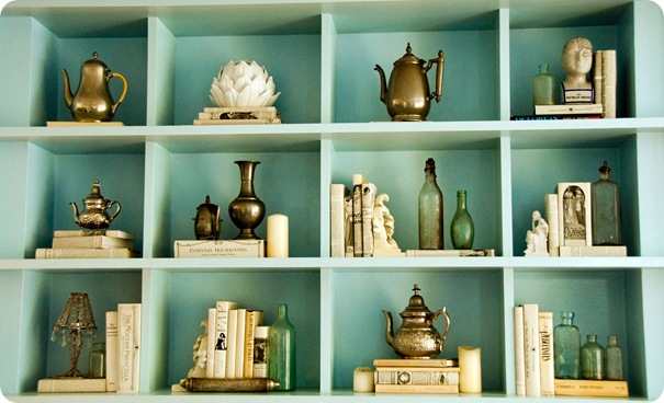
When styled against a backdrop of robin’s egg blue, this collection from the home of model Coco Rochas has visual appeal, and showcases a love of books, antique coffeepots, vases, and glass bottles. Highlands Designs has partition bookcases like this that divides the space into multiple cubes.
via Vogue
Think in Layers
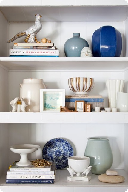
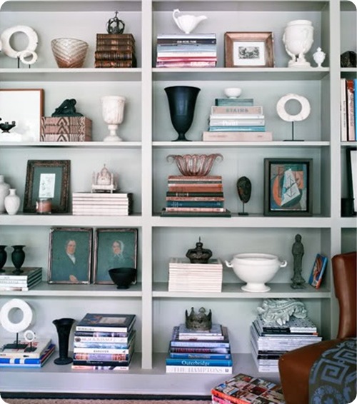
Here is a shelf masterfully styled by Emily Henderson. Notice the balance achieved between the books alternating in placement from left to right with the ceramics poised on the opposite side. The middle shelf repeats the books plus ceramics combination, and also provides the opportunity to display smaller collectibles. Different heights and textures also add to the appeal.
Vary Book Placement
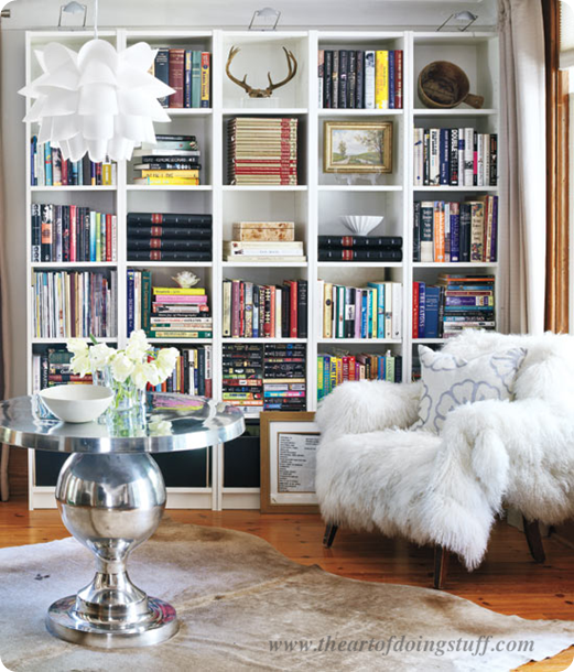
Did you know there are 7 ways to stack books? Karen from The Art of Doing Stuff teaches us how she styled hers in her partition bookcases to break up the columns. Notice how she doesn’t just stick to books, she adds art and natural objects too. And don’t you love that reading chair?
Arrange Books by Color
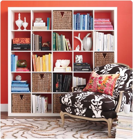
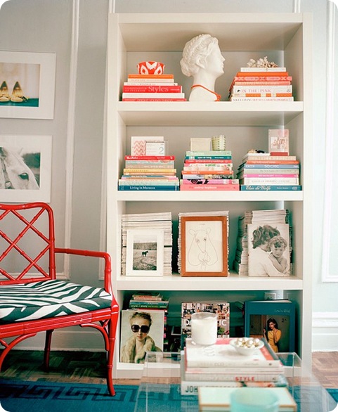
Inside this IKEA Expedit, the books are grouped by color, and also displayed both horizontally and vertically. Practical baskets mix with glass bowls, vases and collectibles to form an aesthetically pleasing display on a brightly painted wall.
via Style at Home
Hang Something
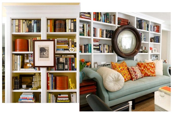
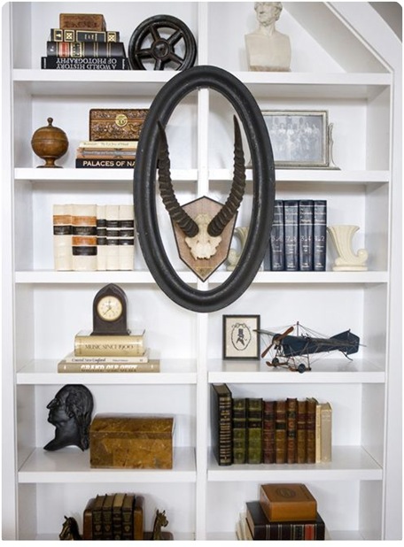
There’s no rule you have to keep it all inside. Why not add one more layer of interest? Consider using the framing of the bookcases to suspend a dramatic mirror, framed artwork, or sentimental photographs.
House Beautiful; source unknown
via HGTV
It’s OK to be Single
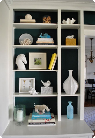
Smaller cubbies look simply perfect with a textured or sculptural object placed all by itself. Notice the use of a single vase or shell in the smaller spaces of John & Sherry’s bookcase, and the fantastic contrast with bold blue and crisp white.
Think Oddly
Objects tend to look better when gathered in odd numbers, and the basic design principle of the rule of threes is cleverly applied in this bookcase featured in Lonny Magazine. Notice how most of the books are stacked horizontally, but the bookcase becomes so stylish with the varied and perfectly placed decorative objects, prints, and forward facing book covers.
via Lonny
Varied groupings of three or five are always visually appealing. This bookcase from the home of Lisa Martensen is an example of a well edited display from her treasure hunts and travels all around the world.
via D Magazine
Allow Room to Breathe
With airy shelving, it’s best to not overwhelm and allow for plenty of breathing room around objects. Deliberate use of open space keeps the eclectic collection on this bookshelf from appearing too cluttered.
via Viva Terra
With a little concentration, it’s possible to style a bookshelf well with both books and the things you love. The secret to doing it successfully is truly all in the placement and editing of your favorite objects.

